

Client
Job Finding App Design Sprint
Duration
November 2nd – 9th, 2022.
Role
UX Designer Student
Responsibilities
User Research, Wireframing, Prototyping, and Usability Testing
I’m Quinn, a UX design student currently enrolled in UX design Google’s program. I was tasked with creating a job-finding app designed specifically for individuals who feel stuck in unfulfilling careers. The goal of the project was to develop a digital platform that helps users not only discover new career opportunities but also supports them through a smooth transition into their new roles.
Understanding the Problem
Many individuals are dissatisfied with their current jobs and are eager to transition into new careers but lack the necessary tools and guidance to do so effectively. The challenge was to create an intuitive, user-friendly app that could address this issue and support users in finding and pursuing new career paths.






Retrospective Insight:
In hindsight, expanding the research to include recruiters and hiring managers would have provided a more holistic perspective. Understanding what employers look for in candidates and how they prefer to engage with potential hires could have informed the app’s features and improved its effectiveness. However, this was a quick sprint project, and I focused on the user side due to time constraints.
Designing the Solution
Wireframing
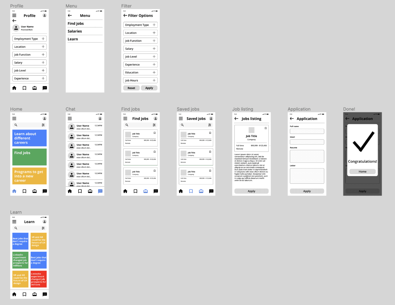
Created digital wireframes with a focus on easy-to-click links and intuitive bottom navigation.
Prototyping
Developed a low-fidelity prototype to visualize the app’s core functionality.
Low-fidelity Prototype

Usability Testing
Testing
Conducted a moderated usability study with five participants from Canada.
Findings
Identified issues such as difficulty differentiating between pages and problems with the filter feature.
Low-fidelity Mockups
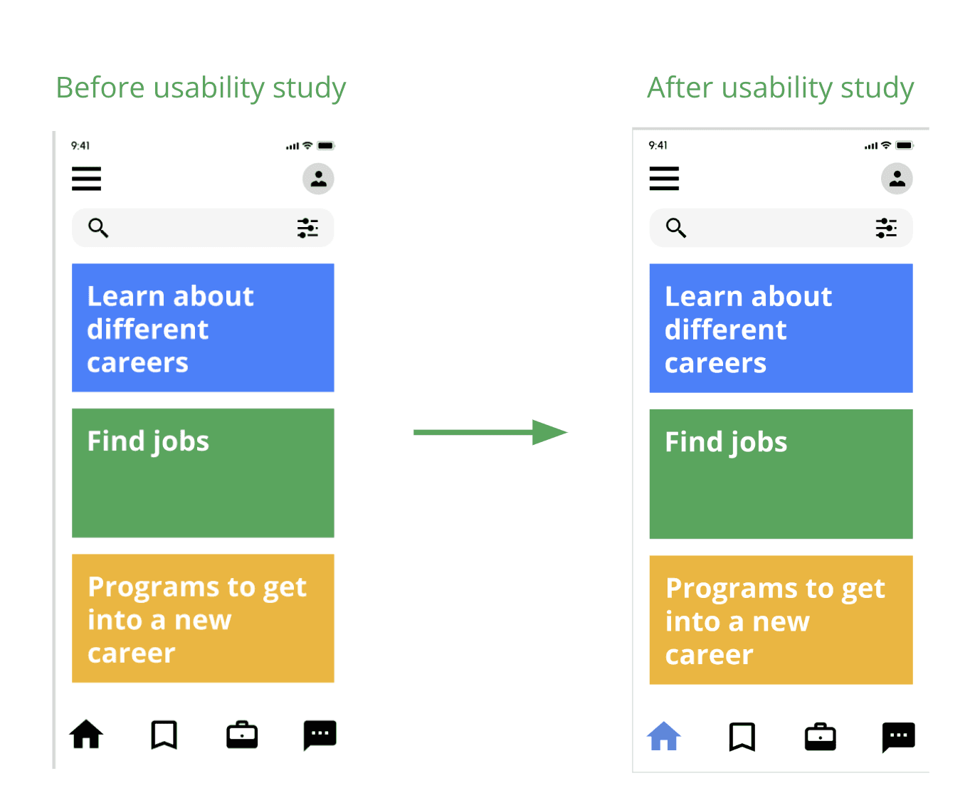
Users reported difficulty distinguishing between different pages, so I added a highlight to the active page in the navigation bar to make it clear where they were.

Low-fidelity Mockups
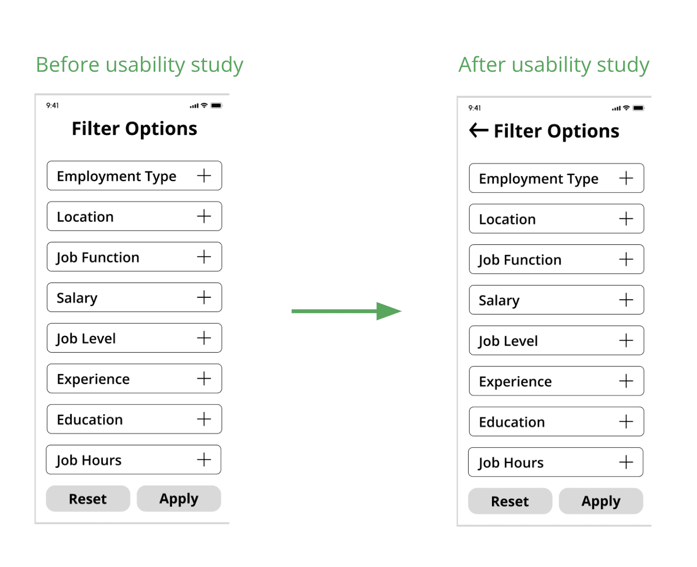
Added a back button to the filters to help users navigate away from dead ends.

Final Prototyping and Responsive Design
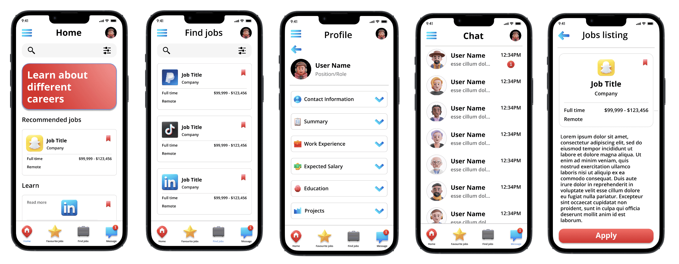

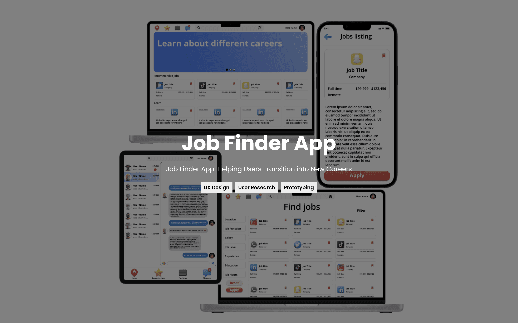
Responsive Design: Ensured a consistent and accessible experience across all devices.


Final Summary
The Job Finder App was my first major project in Google’s UX Design course and my introduction to responsive design. The goal was to help individuals stuck in unfulfilling careers find new opportunities and transition smoothly.
During the week-long project, I focused on user needs, creating a simple, clear app experience across devices. Usability testing led to improvements like better page differentiation and intuitive filtering.
Looking back, gathering insights from recruiters would have further enhanced the design, but given the quick sprint, my focus remained on the user experience. This project was a valuable learning experience in balancing user needs with broader perspectives.
Thanks for looking!

Client
Job Finding App Design Sprint
Duration
November 2nd – 9th, 2022.
Role
UX Designer Student
Responsibilities
User Research, Wireframing, Prototyping, and Usability Testing
I’m Quinn, a UX design student currently enrolled in UX design Google’s program. I was tasked with creating a job-finding app designed specifically for individuals who feel stuck in unfulfilling careers. The goal of the project was to develop a digital platform that helps users not only discover new career opportunities but also supports them through a smooth transition into their new roles.
Understanding the Problem
Many individuals are dissatisfied with their current jobs and are eager to transition into new careers but lack the necessary tools and guidance to do so effectively. The challenge was to create an intuitive, user-friendly app that could address this issue and support users in finding and pursuing new career paths.


Retrospective Insight:
In hindsight, expanding the research to include recruiters and hiring managers would have provided a more holistic perspective. Understanding what employers look for in candidates and how they prefer to engage with potential hires could have informed the app’s features and improved its effectiveness. However, this was a quick sprint project, and I focused on the user side due to time constraints.
Designing the Solution
Wireframing
Created digital wireframes with a focus on easy-to-click links and intuitive bottom navigation.
Prototyping
Developed a low-fidelity prototype to visualize the app’s core functionality.
Low-fidelity Prototype


Usability Testing
Testing
Conducted a moderated usability study with five participants from Canada.
Findings
Identified issues such as difficulty differentiating between pages and problems with the filter feature.
Low-fidelity Mockups
Users reported difficulty distinguishing between different pages, so I added a highlight to the active page in the navigation bar to make it clear where they were.


Low-fidelity Mockups
Added a back button to the filters to help users navigate away from dead ends.


Final Prototyping and Responsive Design


Responsive Design: Ensured a consistent and accessible experience across all devices.


Final Summary
The Job Finder App was my first major project in Google’s UX Design course and my introduction to responsive design. The goal was to help individuals stuck in unfulfilling careers find new opportunities and transition smoothly.
During the week-long project, I focused on user needs, creating a simple, clear app experience across devices. Usability testing led to improvements like better page differentiation and intuitive filtering.
Looking back, gathering insights from recruiters would have further enhanced the design, but given the quick sprint, my focus remained on the user experience. This project was a valuable learning experience in balancing user needs with broader perspectives.
Thanks for looking!

Client
Job Finding App Design Sprint
Duration
November 2nd – 9th, 2022.
Role
UX Designer Student
Responsibilities
User Research, Wireframing, Prototyping, and Usability Testing
I’m Quinn, a UX design student currently enrolled in UX design Google’s program. I was tasked with creating a job-finding app designed specifically for individuals who feel stuck in unfulfilling careers. The goal of the project was to develop a digital platform that helps users not only discover new career opportunities but also supports them through a smooth transition into their new roles.
Understanding the Problem
Many individuals are dissatisfied with their current jobs and are eager to transition into new careers but lack the necessary tools and guidance to do so effectively. The challenge was to create an intuitive, user-friendly app that could address this issue and support users in finding and pursuing new career paths.


Retrospective Insight:
In hindsight, expanding the research to include recruiters and hiring managers would have provided a more holistic perspective. Understanding what employers look for in candidates and how they prefer to engage with potential hires could have informed the app’s features and improved its effectiveness. However, this was a quick sprint project, and I focused on the user side due to time constraints.
Designing the Solution
Wireframing
Created digital wireframes with a focus on easy-to-click links and intuitive bottom navigation.
Prototyping
Developed a low-fidelity prototype to visualize the app’s core functionality.
Low-fidelity Prototype

Usability Testing
Testing
Conducted a moderated usability study with five participants from Canada.
Findings
Identified issues such as difficulty differentiating between pages and problems with the filter feature.
Low-fidelity Mockups
Users reported difficulty distinguishing between different pages, so I added a highlight to the active page in the navigation bar to make it clear where they were.

Low-fidelity Mockups
Added a back button to the filters to help users navigate away from dead ends.

Final Prototyping and Responsive Design

Responsive Design: Ensured a consistent and accessible experience across all devices.

Final Summary
The Job Finder App was my first major project in Google’s UX Design course and my introduction to responsive design. The goal was to help individuals stuck in unfulfilling careers find new opportunities and transition smoothly.
During the week-long project, I focused on user needs, creating a simple, clear app experience across devices. Usability testing led to improvements like better page differentiation and intuitive filtering.
Looking back, gathering insights from recruiters would have further enhanced the design, but given the quick sprint, my focus remained on the user experience. This project was a valuable learning experience in balancing user needs with broader perspectives.
Thanks for looking!


Client
Job Finding App Design Sprint
Date
November 2nd – 9th, 2022.
Role
UX Designer Student
Responsibilities
User Research, Wireframing, Prototyping, and Usability Testing
I’m Quinn, a UX design student currently enrolled in UX design Google’s program. I was tasked with creating a job-finding app designed specifically for individuals who feel stuck in unfulfilling careers. The goal of the project was to develop a digital platform that helps users not only discover new career opportunities but also supports them through a smooth transition into their new roles.
Understanding the Problem
Many individuals are dissatisfied with their current jobs and are eager to transition into new careers but lack the necessary tools and guidance to do so effectively. The challenge was to create an intuitive, user-friendly app that could address this issue and support users in finding and pursuing new career paths.
Understanding the User
User Research
Conducted research to understand the needs and pain points of individuals seeking career changes.
User Personas
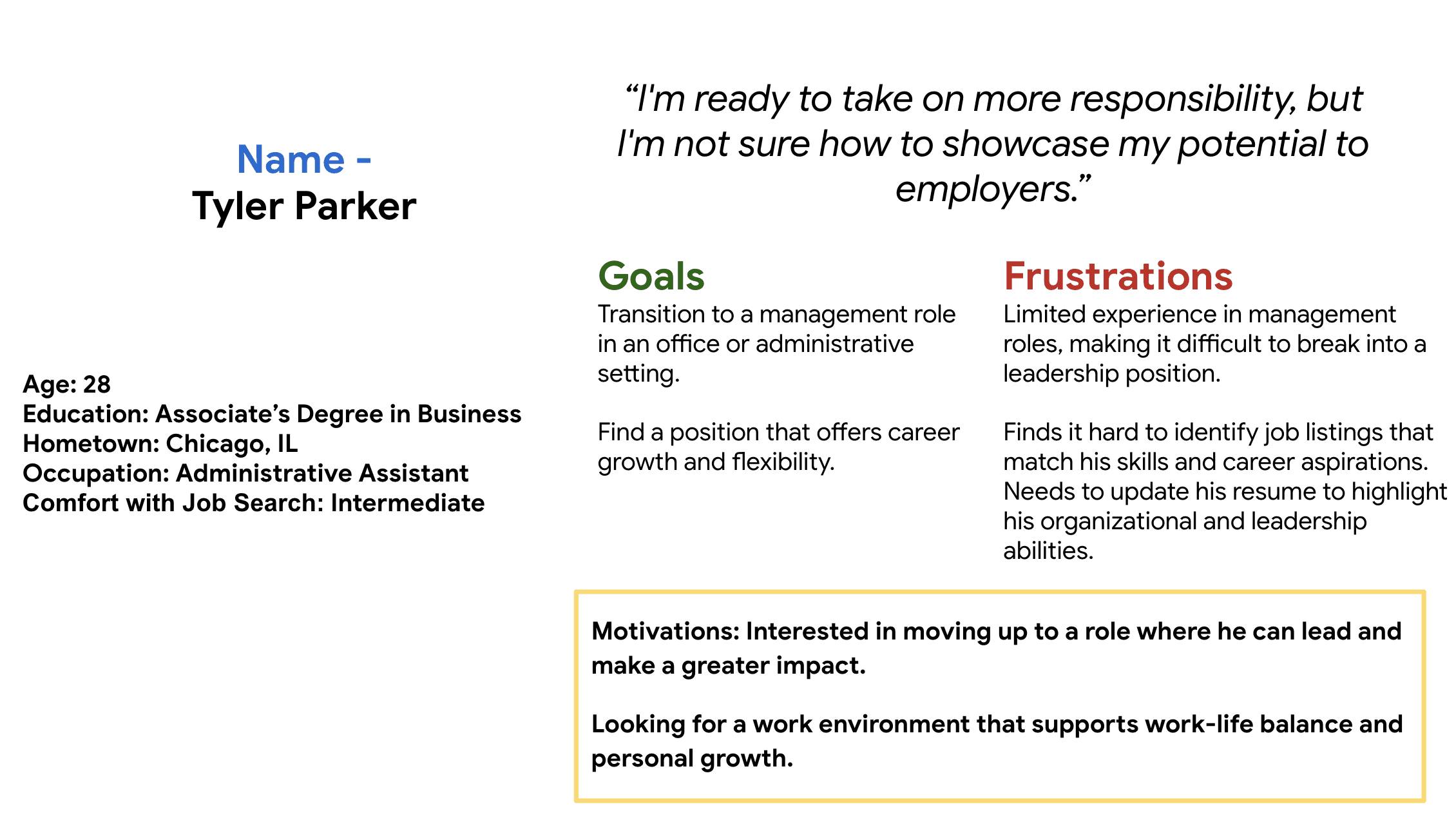
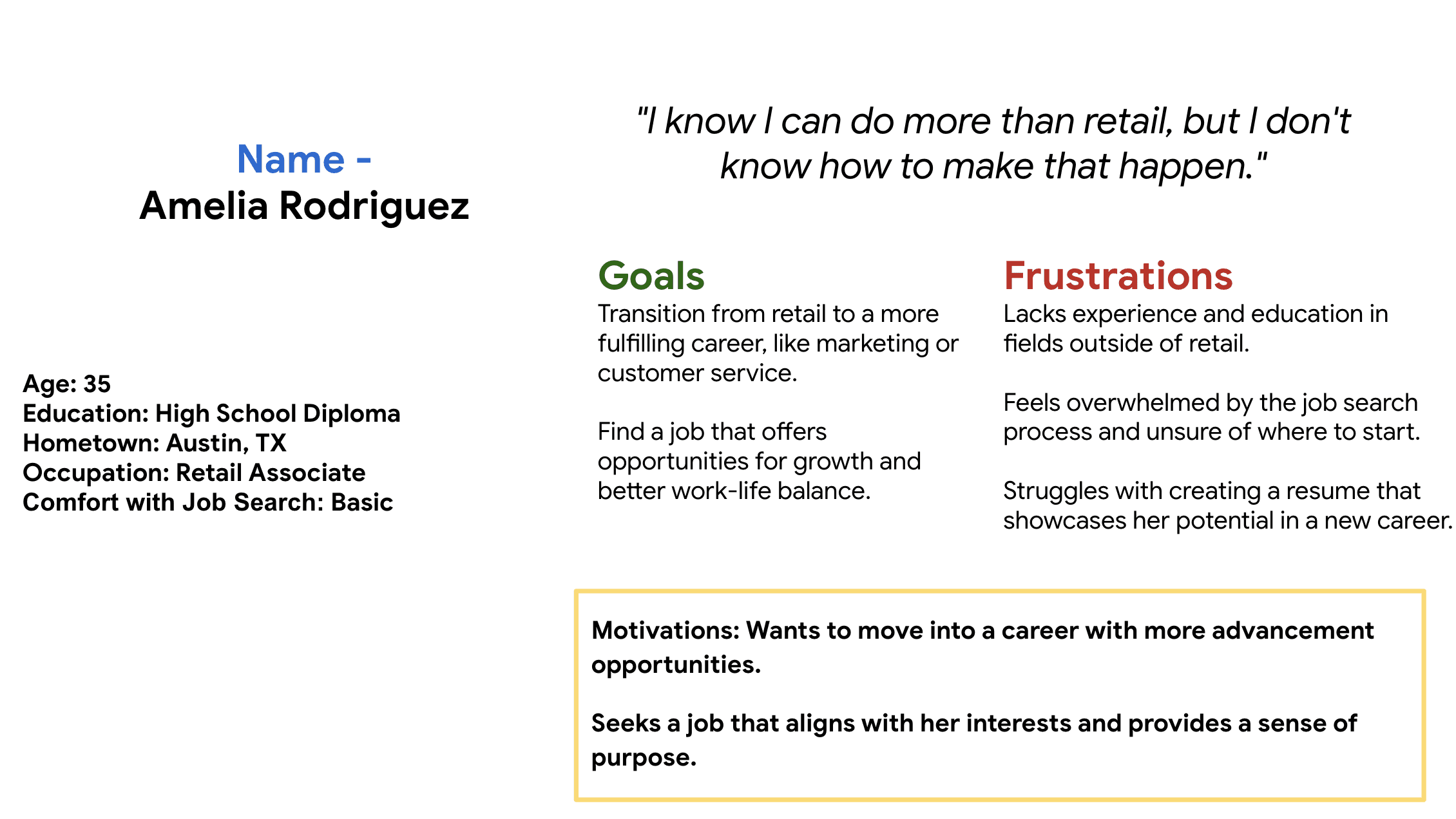
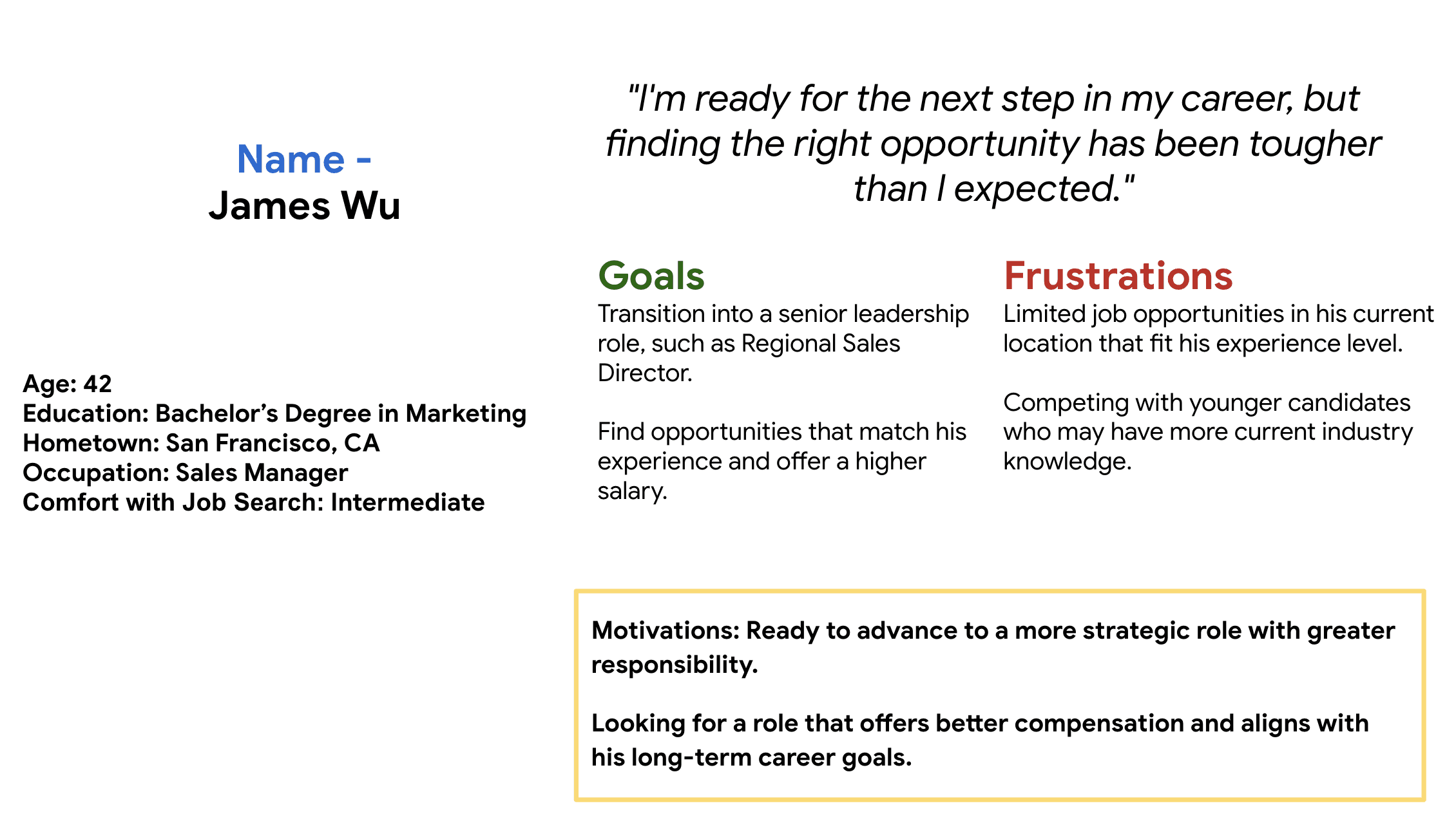
Developed key personas, such as "Tyler," a retail worker feeling stuck in his job, to guide the design process.
Competitive Audit
Analyzed existing job-finding platforms to identify gaps and opportunities.
Ideation
Brainstormed potential features and design elements that could address the users' needs.


Retrospective Insight:


Designing the Solution
Wireframing
Created digital wireframes with a focus on easy-to-click links and intuitive bottom navigation.
Prototyping
Developed a low-fidelity prototype to visualize the app’s core functionality.
Low-fidelity Prototype


Usability Testing
Testing
Conducted a moderated usability study with five participants from Canada.
Findings
Identified issues such as difficulty differentiating between pages and problems with the filter feature.
Low-fidelity Mockups
Users reported difficulty distinguishing between different pages, so I added a highlight to the active page in the navigation bar to make it clear where they were.


Low-fidelity Mockups
Added a back button to the filters to help users navigate away from dead ends.


Final Prototyping and Responsive Design


Responsive Design: Ensured a consistent and accessible experience across all devices.


Retrospective Insight:


Final Summary


Thank You!